Tuesday, November 30, 2010

Kremer Pigments

My Kremer Pigments order is in. This company pleases me to no end. Orders come in quickly and complete. So, I have found a home with Kremer.

Here is a nice range of bright colors. Tonight I'll try out the Thalo Blue on my blue jay. If that's not the ticket, I'll order up a bit of Cerulean blue pigment.


Many of Kremer's pigments come in bags, especially when ordering in the 50 to 100 gram sizes. Oftentimes, pigments are offered in various grinds. The Verona Green Earth very fine ranges from 0-80 μ. Standard has a particle size of 0-120 μ. By way of reference, those synthetic organic pigments above range from 0.1-5 μ. Tiny!

Monday, November 29, 2010

Getting Organized

Here's a peek into my latest egg tempera setup.

Each pigment ready to mix. (More jars are on the way.)


I used to keep my egg in a little porcelain bowl covered with plastic wrap. I'd be poking about for something or other to get a bit of egg onto the palette. Now I've got the perfect arrangement!

Sunday, November 28, 2010

Shaky Bird Post


I'm posting from my Droid X this evening as internet is failing via comcast. Then the big machine had trouble booting. Then the Droid locked up. Weird...

UPDATE: Thanks be for the Droid! I was able to confirm that the East Coast is down on a DNS issue. I was also able to find out that I could drop in Google's DNS (8.8.8.8) and voila, my laptop is up and running and I can make a wireless jump to the big machine for images! I've always thought that I could use the smartphone as a blogging backup. It works, but is certainly less than optimal.

So here's a bit of work on the blue jay. I've been reading up on oil painting techniques and perhaps they might apply well with tempera. For instance, simply laying in large areas of color or even just tone. I tried a Gaussian Blur in Photoshop to take out details and see the overall patches of tonality. It's so interesting and exciting to open up to new ways of seeing and working a painting.


Saturday, November 27, 2010

Blue Jay - Starting Color

After a bit more silverpoint, I dropped in some beginning color. Looking forward to the Phthalo blues from Kremer but current stock will do for now. I like how the head is coming but the tail... ah, it looks rather chewed. It may be due for a scraping and sanding if recovery goes as expected.

I seemed to notice the lifting of silverpoint with the first coat of tempera. I somehow had it pegged as more resilient but it took a quick light first coat to hold it well in place.


Friday, November 26, 2010

Blue Jay

I want to try a bird.

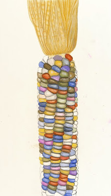
This is a tracing from an earlier blog photo onto gesso with Saral, then firmed up with silverpoint. I used graphite on the corn and some little carbon particles seem to float about the tempera. Then I inadvertently smeared my palm across some tracing. What a mess! I was hesitant to remove graphite with erasers, fearful of contaminating the gesso surface. The only method I've found useful for removal is sanding.


Odds and Ends

The remaining kernels painted in, some balancing between the ear and husk, a final sanding on the unpainted gesso to clean up spills, and my painting was ready for framing.


My tempera workflow continues to firm up. I like porcelain palettes, until now using mostly various sized and shaped plates from Pier 1 Imports. My new small welled palettes from DickBlick are proving perfect for my egg mixes. A bit of pigment, preferably from my new jars, placed into a well and mixed with egg is the starter. From there, bits of that mix can be dropped into other wells for thinning with water and/or adding Titanium White (held in the large center well) for lightening or opaqueness. The way these wells nestle the mixes leads to increased working time before the mixes coagulate and dry.


A couple of new books just arrived! Click on each image to link to a preview on Google Books.


Thursday, November 25, 2010

Pigment Maintenance

I am beginning the task of mulling and bottling each dry pigment. As I mentioned earlier, this method has become favorite, at least for now.


More Penzeys bottles are soon to be ordered and a new order of pigments was recently placed with Kremer:
  • Phthalo Green dark - 20g jar
  • Phthalo Blue - 20g jar
  • Phthalo Blue reddish - 20g jar
  • Irgazine® Orange DPP RA - 20g jar
  • Irgazine® Red DPP BO - 20g jar
  • Irgazine® Ruby DPP-TR - 20g jar
  • Permanent Yellow medium - 20g jar
  • Dioxazine Violet - 20g jar
  • Alizarine Crimson dark - 20g jar
  • Verona Green, very fine - 50g
  • Titanium White Rutile - 100g
All these pigments carry an "AP" rating from The Art & Creative Materials Institute (ACMI). Here's the AP rating defined:

"The new AP (Approved Product) Seal, with or without Performance Certification, identifies art materials that are safe and that are certified in a toxicological evaluation by a medical expert to contain no materials in sufficient quantities to be toxic or injurious to humans, including children, or to cause acute or chronic health problems. This seal is currently replacing the previous non-toxic seals: CP (Certified Product), AP (Approved Product), and HL Health Label (Non-Toxic) over a 10-year phase-in period. Such products are certified by ACMI to be labeled in accordance with the chronic hazard labeling standard, ASTM D 4236, and the U. S. Labeling of Hazardous Art Materials Act (LHAMA). Additionally, products bearing the AP Seal with Performance Certification or the CP Seal are certified to meet specific requirements of material, workmanship, working qualities, and color developed by ACMI and others through recognized standards organizations, such as the American National Standards Institute (ANSI) and the American Society for Testing and Materials (ASTM). Some products cannot attain this performance certification because no quality standard currently exists for certain types of products."

Wednesday, November 24, 2010

With Husk

I spent some time this evening bringing in the husk. After a few hours, I figured it best to lay it aside. I might want to wash it down lightly with a bit of white and better connect the husk to the ear. It's a bit off but that's okay for now.


Tuesday, November 23, 2010

Closing In on the Kernels

Getting there. Phew, there sure are a lot of kernels! :-) I'm working two to three hours each night and completely enjoying the experience. I wish I had more time... I'd like to turn from the cob for a bit and try my hand at the detail in the husk.


Now it's time for another Kremer order. More on that soon! :-)

Monday, November 22, 2010

Keeping Pigments Ready

There are many ways to handle pigments prior to tempering--dry, wetted and mulled; dry, wetted and mixed with a palette knife; in dispersion; or kept in distilled water. I think I'm coming around to the last example.

Before my store bought pigments arrived, I mulled North Carolina pigment prior to mixing into a tempered paint. What's important though is that mulling is only partly used for and useful for grinding pigment. Better grinding is probably accomplished with a mortar and pestle. Where mulling really shines is for separating particles simply stuck together and more importantly surrounding each tiny particle with water.

Instead of mulling, particles can sometimes easily be mixed well with water using only a palette knife. This is my most often used technique. A palette knife is quite sensitive to particle size. I can see, hear, and feel grit with a knife against my porcelain palette.

I have a few bottles of dispersions. They're okay but the pigment particles are held in suspension with the help of additives. I don't know what those extra ingredients are and don't really detect anything unique about them. One problem I find with dispersions is that when I open the cap, there is always some dried pigment that falls out and lands on my palette. I hate that. The other thing is that getting just the smallest drop I can is often too big. So, there is convenience and inconvenience.

And now, my the final technique. Dry pigment is either mulled or mixed with a palette knife, placed into a jar, and covered with distilled water. A rather hard to discern example is below. My apologies, as this is German Vine Black and really doesn't show very well. There's about a 5mm layer of pigment settled in nicely. I also used a bit of isopropyl alcohol as a wetting agent. By the way, this jar came from Penzey's Spices. I buy my herbs and spices in bags and keep cooking amounts in these four ounce jars.


When I want to use German Vine Black, I open the jar, tip it to the side, and scoop out just what I need. It's already mixed, wetted, and the perfect amount. Although this was only mixed with a palette knife, it should probably have been mulled as I can see granulation in my tempera. That's cool if that's what I want, but I am leaning towards smooth pigment mixes so I will probably mull this batch. And, I will probably mull all pigments as I jar them up.


My palette knife is an okay tool for scooping pigment but I want something still smaller. I envision making my own tiny trowels for scooping and mixing.

Sunday, November 21, 2010

Slow Corn Continued

Experiments with black and white are helping to develop form although I do wonder if heavy black was introduced too quickly. Ah, the impatience at times... I'm learning that even with my limited set of pigments that many colors can be reached with simple overlays, especially when selectively applied. For instance, I won't wash over a kernel but only around the edges. Also, that a bit of white makes a fine highlight, as well as a great cover for mistakes.


Saturday, November 20, 2010

Quotes From The Past

I've discovered some fine and old documents on the eggtempera.com site, volumes of articles from the Society of Painters in Tempera.

Quoting from a portion of the article Yolk Of Egg Tempera by R. Spencer Stanhope, April 23, 1903 :

"The Advantages are as follows :-
Pictures painted with the Yolk of Egg possess the Richness and depth of Oil
Paintings, without losing any of the brilliance of colour which oil to a certain extent injures. In fact there is no medium of any kind in ordinary use for painting which so little, if at all, affects the colours with which it is mixed, whilst it gives a softness of effect which is more or less wanting in all the others; and that this quality is permanent may be seen in any Cinquecento work which has not been meddled with in any way, and the colours will there appear as brilliant as on the day they were painted. As the colour dries in a minute or two the part on which the painter is at work can be completed off-hand, the colour remaining permanently the same. The slight yellow tint caused by the yolk disappears entirely in a few days. All marks of the brush pass away as the colour dries, and a perfectness of surface is obtained without any effort on the part of the painter; and, as I mentioned before, owing to the natural grease in the yolk of egg the soft rich effect of oil is produced whilst the painting can be seen in any light as is the case with fresco or water-colour. From the day of painting the colour the surface steadily hardens and, provided the technical part of the work is properly done, this hardening process goes on without any cracking or shrinking of the surface till it reaches that pitch of hardness which is so notable in Cinquecento work. Finally, as the painter puts the colours on the panel he can judge of the permanent effect, which is not the case with mediums such as Oil, Fresco and ordinary Distemper."

I'm working on my corn but it's a slow haul. I'm checking out synthetic pigments by Kremer--rich colors and small particle size. For instance, using a cadmium yellow was an incredibly smooth painting experience but I am leaning away from toxic materials. There seems to be a good selection of innocuous and luscious synthetics.

Friday, November 19, 2010

Slow Corn

Oh ya, this is going to take some time! :-)

At this point, I'm not looking for color accuracy but simply a starting point. It's really great practice working small areas for smooth brushing and experimenting with overlays.


I just discovered that Dover Publications offers freely usable art vector diagrams on CD! They even offer a weekly subscription of free samples, and if you sign up you also get some instant free samples. Very cool!

Thursday, November 18, 2010

Maize

Although the sky/tree painting is still ongoing, I want to take some time away from it. Yesterday I hunted about the yard and then the produce section of the grocery but nothing jumped at me. Later I picked up a fresh dozen eggs at the local farm stand and came across some beautiful ears of corn!

I took a shortcut by photographing, processing in Photoshop, taping tracing paper to the LCD on the laptop, tracing, and transferring to a gesso panel. The yellow is dropped in for placement guidelines.

This yellow is a cadmium--so smooth, so grit-free. That is not so for all my pigments and I'm pondering how to handle rougher pigments. Can I mull them to the smoothness I want for this painting? Will I need to search out finely ground pigments?


Wednesday, November 17, 2010

Margaret in Paint and Prose

I received a lovely email today and with the writer's permission I will share with you. Margaret and I "met" as students during both of the Cornell drawing and watercolor online courses. In our mixed and lively discussions, she mentioned how she dug her own earths. Of course, I just had to have some, and in fact, her offer came before my request.

Here is Margaret's watercolor using only her North Carolina earths that I ground and tubed up.


And here is her letter:

Hey John,

I am going to try and attach a scan my 1st painting using only the "Earths"

Meantime, there is a little bit of story behind the ochre-ish PB.

On the way to my parents house in N. Ga. I take a back road and in a curve just over a hill is a gas station of the kind I suspect is indigenous only to our region and southward. When it was open, there were boiled peanuts when in season, so the place was often shrouded in smoke. Through the smoke, you could see cars in various stages of assembly, or dis-assembly. A rack of dented aluminum canoes for rent and a goat wandering about freely don't even begin to complete the picture.

Behind and beside this is the bank of beautiful yellow earth.

I have eyed that bank for ages, but never stopped. The gas station/store was just too complex to take in.

Last year the store closed. Everything is there except the goat, but it is all still.

It seemed like the only thing going on there was gravity, so on one trip home I whipped the car over, got some Dollar General bags out from under the debris in the backseat and went to clawing earth out of the bank. A dog came along, but I didn't pay much attention. I was engrossed in finding color and in appearing non-chalant when cars passed. When I did finally look up, there was an enormous, big bearded man standing in the door of the store. His arms were crossed and his demeanor did not appear to be friendly.

"Hi," I said.

No reply.

"I'm just getting some dirt."

No reply.

"I'm gonna make some paint."

No reply. Just then the dog almost got hit by a car.

"That your dog?"

Head shake.

"You know whose it is?"

Another head shake.

"I think it might get hit, maybe I should find it's home."

Head nod. Demeanor unchanged.

" Well, is it OK if I take this dirt?"

Head nod.

"Well I guess I'll take the dog, too."

Head nod.

"Thank, you"

No reply.

He was still standing in the door with his arms crossed as I packed in the dog, earth and headed down the road.

The dog was reconnected with its owners at next establishment.

A brief splinter in geologic time.

The painting evolved with experience, and skill with the paint will continue to evolve, I hope.

I learned to be lighter, worked it right to left and you can see the change. The right is much too heavy.

I actually began to enjoy the limited palette. It's a little like working with ink washes, but w/subtle colors and different behavior. I love the little mica sparkles in the wash.

I am thinking toward doing another an adding just a little bit of wash from my commercial paints.

Fun and challenging. I looked up egg tempera recipes and find myself tempted.

Waiting for a large slot of uninterrupted time.

Thanks

MO

Tuesday, November 16, 2010

Daniel V. Thompson

I have so very much appreciation for the works of Daniel Varney Thompson, Jr. (1902-1980) If you're not familiar with him, you may remember some recent posts with quotes from his The Practice of Tempera Painting.

Below are back cover quotes from his other books:

The Materials and Techniques of Medieval Painting

"Medieval painters built up a tremendous range of technical resources for obtaining brilliance and permanence. In this volume, an internationally know authority on medieval paint technology describes these often jealously guarded recipes, lists of materials, and processes.

"Based upon years of study of medieval manuscripts and enlarged by laboratory analysis of medieval paintings, this book discusses carriers and grounds, binding media, pigments, coloring materials, and metals used in painting."

The Craftsman's Handbook: "Il Libro dell' Arte" by Cennino d'Andrea Cennini

"This is D. V. Thompson's definitive English translation of "Il Libro dell'Arte," an intriguing guide to methods of painting written in 15th century Florence. Embodying the secrets and techniques of the great masters, it served as an art student's introduction to the ways of his craft.

"Anyone who has ever looked at a medieval painting and marveled at a brilliance of color and quality of surface that have endured for 500 years, should find this a fascinating read. It describes such lost arts as gilding stone, making mosaics of crushed eggshell, fashioning saints' diadems, coloring parchment..."

All three are available as inexpensive Dover's. Fun and interesting reads! And of course, my copy of The Practice of Tempera Painting is getting lots of use. :-)


Monday, November 15, 2010

A Bit Of Shadow

Just a bit of black pulled these trees back. I want more from this image but I'm not sure yet where to go.


You might already know me as a fan of German Vine Black. One thing, though, is that this stuff does not mix well with water. But with a few drops of isopropyl alcohol, the charcoal simply melts.

Sunday, November 14, 2010

Thoughts On Drawing

As I ponder how to shadow and highlight the trees, I think, as I often do, that I might do well to draw often with pencil and paper. I like this paragraph from Drawing Lessons From the Great Masters by Robert Beverly Hale:

"Of course, if there were no light, there would be no shade or shadow: nothing for us to see, nothing to draw. It is only when light plays upon an object that we can see the form emerging. So the artist becomes incredibly sensitive to the play of light on form. Beginners usually see only about three tones when light plays on a white object: black, white, and gray. But the accomplished artist sees thousands. In fact, it is in this field--the field of light and shade--where a great difference exists between the beginner and the accomplished artist."

No picture today. I've been working the tree shadowing and like having some darker tones in place to push the trees back a bit. Not much to see yet as I feel my way about... :-)

Saturday, November 13, 2010

Border Wrap and Trees Underway

Poor reader, how many days can I subject you to the same painting? And I'm afraid there's more to come, but I am having an awful lot of fun as well as learning a good deal.

This evening the inner faces of the frame were masked and toothbrushed in. Then some cemented-like joints. And lastly, the trees were roughed in. I spent some time this afternoon gazing at swamp maples as an effort to gain inspiration.


Friday, November 12, 2010

A Better Border

This evening I worked with masks and a toothbrush. First applied was a medium gray, next pure black, and finally pure white. Black was my favorite German Vine Black. White was the usual Titanium White. I'll do something similar with the bevels once I plan the light source and shadowing. This technique would probably look very cool with violets, pinks, and who knows what else. I think I got a bit inspired while looking at all kinds of stone today--fieldstone, sidewalk, fountain, war memorial, all were talking to me.


For more inspiration, I made my first visit to the Museum of Russian Icons. There is a gallery devoted to icons on loan through July 25, 2011 from the Andrey Rublev Museum of Moscow. It's hard to grasp, devotional egg tempera hundreds of years old. I expect many visits to come. Non-flash photography is allowed so perhaps I can offer a few peeks into this wealth of historical and religious art work.


Thursday, November 11, 2010

Adding A Border

It's been a busy day at the kitchen table. There were pigments to grind and tubes and pans to fill. After all that, I caught a second wind and went back into the sky grading. And lastly, I dropped in a start on the border. I tried a sponge but don't really like the results--maybe some toothbrush splattering might be right. I would have tried that tonight except that, I'll admit it, I was too lazy to cut out the masking. :-)


Wednesday, November 10, 2010

Sky 2 Continued

This is not easy! :-) I'm getting a bit of feeling for the gradation but clearly need a lot of practice!

I figured enough blue for now and pulled the tape, sponged in ochres for fallen leaves, and spread a gradated wash. The wash pigment is a brand new acquisition. The Kremer order arrived today with lots of cool stuff. More on all that later but the pigment in question is Jarosite, a lemon yellow ochre from Cyprus. It builds up a lovely glow of great transparency. It's very manageable with gradation. An instant favorite! :-)

Quoting from the Kremer catalog:

"Lemon Yellow Ochre is the clearest yellow ochre occurring naturally, without the deeper tone of French ochres. Because of the political situation of Cyprus the mining of this rare and beautiful earth has been neglected, but now a small amount of manual production is once again available. Other deposits of natural ochre of this clarity may exist, but the Cyprian Limonite has always been famous for its unique hue."

By the way, very reasonable at $15US for 100 grams.


Tuesday, November 9, 2010

Sky - Second Try

After last evening's post, I took a single-edged razor to my sky and scraped it nearly clean to the gesso. Left was a very thin coat that resisted sanding. In fact, sanding created a whole new mess! Now there were tiny bits of egg tempera stuck all over the surface. A wipe down with denatured alcohol left an incredibly smooth surface. I couldn't have been more pleased.

Next was to reapply the base coats. I built my mixes and took great care and time in applying layer after layer to build up a nice opaque base. I once encountered a bit of pick up and from then on checked for dryness by playing light off the surface. I found that I could mix my base mixes to pull out in between colors, a trick I will expand on with my next sky. I think I might have to use only two mixes, one very blue and one very white. Start from each end and then work towards the middle while crossing mixes. Blue can only get so light with white mixed in and white needs to be kept in reserve to build darker whites ever so carefully.

Another little trick I picked up was in regards to brush control. My previous sky was plagued with little ridges and valleys from the brush bristles. Dragging the brush ever so slowly prevented those drag lines. Amazing!

Ah, my disappointment, very nearly disgust, with my first sky has led to a feeling of some accomplishment. The next step is to begin developing transitions using transparent mixes, just a a bit at a time.


Monday, November 8, 2010

Gradation Blues

My sky has taken a turn for the worse. I am regrouping as I think over where I may have gone wrong. At this point, I'd like to try scraping down to gesso for a restart. More on all this tomorrow evening.

Now, here's a closing quote from Thompson on this sky exercise:

"This wide range of effects is easily, almost automatically controlled, and it gives the tempera painter an instrument of great power and adaptability. If he makes use of its special properties, it will reward the inconvenience to which it puts him. There is no sense in turning a studio upside down to gesso panels, grind colors, and then paint gouache. Good drawing paper stretched on a frame, or a good illustrators' board, and any of the excellent-made gouache preparations, will give just as good results. It is only to take advantage of the powers and beauties peculiar to tempera that the painter is justified in giving himself the trouble of practicing it. If he will be content with a graded wash of blue, it is folly for him to look farther than water color; if he will be content to blend his graded blue from dark to light out of opaque mixtures by scrubbing with a brush, his needs can be satisfied by good commercial gouache. But if he wants to control the painting to perfection, to shape the sky as he paints it, to give it some special quality of luminosity, to establish some deliberate relation between it and the rest of his painting, it may be worth his while to grind colors and break eggs instead of buying tubes and bottles in a shop.

"Nothing is a harsher test of a tempera painter's skill in his medium that this very problem that we have been discussing, a graded blue. Even competent painters often make their broad, light gradations chalky or streaky, for want of thoughtful handling. The secret is to preserve the opalescent half tone; for it can be turned toward transparent or opaque, and shaped and modeled as easily and subtly as clay under a sculptor's thumb."

It's good to hear of my sky exercise as "nothing is a harsher test!" :-)

I've been thinking... It is quite reasonable that I ponder Thompson's thoughts on egg tempera. I have never seen an actual painting! I have four visits to museums, gallery, and exhibition planned, three of them displaying egg tempera. More soon on this...

The Sinopia order, albeit incomplete, arrived today with some fine looking pigments. There are a couple of cads and a quin, but as usual it is the earths that most interest me, with such lovely names: Armenian Orange Earth Dark from the Lori Province; Raw Umber Greenish Dark.

Lastly, I just put in a Kremer order for a few earths and an earth color chart with 78 samples. I just love pigments! :-)

Thompson, Daniel V. Jr. The Practice of Tempera Painting. New York. Dover Publications. 1962. (Yale University Press. 1936.) p. 107-8.

There's A New Blog In Town!

Spread the word! There's A New Blog In Town!

Threadspider, aka Judith--yes, the very same who leaves such lovely comments here--has just launched her new blog pencils and paint! By the way, in case you didn't know, she also hosts everything in the garden's rosy.

Judith, I'm looking forward to lots of great watercolor posts and paintings! :-)

Sunday, November 7, 2010

Plans and Considerations

Here's a sketch, using my new Conte crayons, of what I'm envisioning for my first sky. Bare trees, fallen leaves, stone border, perhaps a leaf resting on the border for a trompe l'oeil effect.


A test of opaque grays for covering ability worked well. The Roman Black pigment is quite warm so a bit of Ultramarine Blue neutralized nicely. I'm putting together another pigment order, this time from Kremer, that will include German Vine Black.


An experiment using tiny pieces of sponge with earth pigments indicated that a bed of fallen leaves is possible. Again a test of opaque grays covering ability worked well.


With these tests complete, I can now focus on a smooth sky gradation and more tests of realistic stone. First attempts have been off target.

And, maintaining the rhythm of quoting from The Practice of Tempera Painting:

"This lengthy account of a simple piece of painting may well strike the reader as tedious; but the principle that it is intended to illustrate is fundamental to an understanding of the essential character of tempera paint. Tempera painting is often confused with gouache, on the one hand, and with water color on the other. The basic differences among these media boil down to questions of transparency. Tempera stands midway between transparent water color and opaque gouache, and possesses a flexibility, in consequence, which neither of the other shares. Tempera is not to be thought of as a material: it is a discipline. It is possible to temper pigments with much yolk of egg and little or no white, and to paint water color with them; or, with much white and little egg, to use the same materials for gouache. But tempera painting proper means capitalizing this special character of translucency that sufficient tempering gives to thin coats of pigments in themselves opaque. It means distinguishing the effects of opacity, produced by repeated coats of a single tone, opalescence, produced by painting a lighter tone over a darker, and transparency, produced by painting a darker tone over a lighter."

There is more to come on this subject, but at this point the question arises--is the above quoted statement regarding egg tempera's uniqueness really accurate? Katharine's comment regarding the varying properties of watercolor paints and the effects possible with mixed media watercolor and gouache certainly leaves me to wonder. In fact, even Thompson says that egg tempera is a discipline rather than a material. Interesting stuff... :-)


Thompson, Daniel V. Jr. The Practice of Tempera Painting. New York. Dover Publications. 1962. (Yale University Press. 1936.) p. 106-7.

Saturday, November 6, 2010

Blue Sky

From The Practice of Tempera Painting:

"As nothing can be more distant than a sky, we may begin the discussion of painting procedure with a hypothetical sky, and assume, for the sake of argument, that what is wanted is an even gradation from a dark blue zenith to a white horizon..."

"Let use choose cobalt blue as our basic pigment. If necessary, we may make up a special mixture, turning it a little green with oxide of chromium, or a little violet, say with Indian Red; but in this case,we must put aside some of the mixed color as a separate pigment, and keep it until the painting is finished; for it may be needed again. We will then take three color cups, and into the first put a fairly large amount of the cobalt blue (pure or compounded), and into the third, a very small amount. We will add a small amount of white to the first cup, and a large amount to the third. When each of these mixtures is stirred, we shall have one cup containing a dark blue, and one containing a light blue. Let us put some of each of these into the middle color cup, and mix them together to produce an intermediate blue. Each cup should have its own brush, and each mixture must be tempered with egg for use."

Note: I used straight Cobalt Blue (no green or red) and Titanium White. These are the pigments prior to tempering with egg.


Enough quoting... Instructions next call for applying each mix in a band, with a bit of overlap.


An egg tempera rule is to never try to remove spilled water from a painted surface. Let it dry. Here is an example of the rule not followed. A little dab with a paper towel ripped off all layers down to the surface. This same destruction occurs when I paint over a still wet surface. I find this completely unintuitive as properly tempered paint applied layer after dry layer works very well, so how can all those properly applied and dried layers be torn off so easily? No matter, the results are clear.


Here is my first cut with a bit of gradation applied. The sky is taped off as I have plans for something below and a border pattern. After days of technique practice, it's time to cut loose a bit. :-)


Thompson, Daniel V. Jr. The Practice of Tempera Painting. New York. Dover Publications. 1962. (Yale University Press. 1936.) p. 105-6.

From My Doorstep


Friday, November 5, 2010

Optical Effects - Opalescence

And yet more from The Practice of Tempera Painting:

"If, however, the color lies upon a ground darker than itself, the ground, instead of reflecting light, or having no effect upon it, absorbs part of the light that the layer of paint transmits. The color appears darker; and, being composed of a suspension of finely divided particles, it takes on a cloudy, smoky quality which may be called "opalescence." This quality, to which, in nature, the sky owes its color, and mist or smoke against dark objects, their blueness, stands half-way between opacity and transparency."

Here are examples of light color over darker. Most of these have a glaze over the left hand side. With the exception of the top most block which used a green and bottom with a white, the glazings used yellow ocher. I seemed to find that color closest in hue provided the most pleasing results.

I'm working with more pigments these days (And even more on the way. Sinopia shipped today.) and finding that each pigment takes a different load of egg yolk. Some of my mixes have been on the eggy side. I know this because the finish is too glossy and drying time increases. It's pleasing to see a properly tempered pigment during application. I can actually watch a brushstroke dry within seconds, the light sheen dimming out.

Thompson, Daniel V. Jr. The Practice of Tempera Painting. New York. Dover Publications. 1962. (Yale University Press. 1936.) p. 101.

Thursday, November 4, 2010

Optical Effects - Opacity

More from The Practice of Tempera Painting:

"When the coat of paint lies on a ground of equal value with itself, or on two or three coats of similar color and value superimposed, the surface underneath it is no more reflecting than the paint itself. Light passes into the paint layer and it reflected according to its color and value, and the effect produced is of opacity. Any color in tempera can be made to look opaque by putting on repeated coats of it."


Well, this seems reasonable. I realize that this series is a rudimentary attempt to grasp tempera principles. I'm quite unsure of what's to be learned here but I know I have to give it a try.

A side effect is that I'm approaching mixes with more attention. Most dry pigments seem to need a bit of grinding to subdue excessive granulation. I can't go to the muller for such a tiny bit of pigment so instead the palette knife becomes the grinder. I cannot remember where I've seen an image of a baby muller, just a little thing to be held with fingertips, perfect for that tiny pigment pile. I've found 2" models but something a bit smaller might be nice.


Thompson, Daniel V. Jr. The Practice of Tempera Painting. New York. Dover Publications. 1962. (Yale University Press. 1936.) p. 101.

Wednesday, November 3, 2010

Optical Effects - Transparency

For some time I've been reading instruction on properly handling egg tempera. Not the tempering--I think that's coming along mostly okay. It's the application of light over dark, dark over light, and same over same. I hope within the next few posts to gain a handle on these techniques.

For tonight, an introduction quoted from The Practice of Tempera Painting:

Basic principles of tempera painting

"In the application of the tempered color, it is necessary to understand and apply the optical principles which govern the behavior of colors in tempera. Regardless of the pigments it contains, no well-tempered mixture is absolutely opaque; and, as each mixture ordinarily contains some white, it is not absolutely transparent. Its opacity and transparency are relative, and are conditioned by the values over which the mixture is applied. If it lies over a lighter ground, it appears transparent. Light strikes the paint, passes through it, strikes the lighter ground, and is reflected back to the eye through the layer of paint. Some light has been lost in surface reflection, some has been absorbed in passing through the paint film in each direction, and some has been absorbed by the ground. But as long as the ground is lighter than the paint, it will reflect some light back through it, and produce an effect of transparency. Any color in tempera laid thinly over a lighter ground will act as a glaze."

Yellow ochers for bases painted over with Ultramarine Blue, Cobalt Blue, and Chromium Green. Hmm... perhaps I should have used only a light wash but a mix of overlays might help sort things out. Not sure yet where all this is going but I will step through the techniques, having faith that light will shine in on all this.


Thompson, Daniel V. Jr. The Practice of Tempera Painting. New York. Dover Publications. 1962. (Yale University Press. 1936.) pp. 100-101.

Tuesday, November 2, 2010

A Muller's View

Spooky Halloween trees, or dentritic patterns formed on the underside of the muller with my favorite yellow ochre?


In my early graphite days, modeled form didn't always follow the light source so now I must try to imagine light and shadow--an excellent learning exercise, I think. You may notice some real flips in shadow and highlight from last night's image.

Monday, November 1, 2010

Chestnut Leaf Continues

I spent a few hours trying to add form. The idea of adding white comes slowly; I'm still not used to it but that doesn't stop me from enjoying it. :-) I like where the top left is going and I will try for more of that tomorrow.


More experiments with silverpoint on gesso. The previous example was using one of the old gesso boards, and I don't think it was sanded properly. This example uses the a new board. Look closely and notice the scratches left behind by the 600 grit. The softness of the lower right was caused by a still damp board where I tried to smooth with wet fingers. I'm looking for finer grits, either in carborundum or a 3M product with very smooth surfaces, nearly gritless.


I heard back from Craig Daniel, owner of the Realgesso company, regarding sanding:

" ...we have worked very hard to get to this level with our surface, and hope to continue to improve in the future. As for sanding a 600 grit paper should make the panel super smooth. The amount of smoothness is totally a personal preference. But you do need to wipe the surface with denatured alcohol to keep the dust from invading your paint film. The nice thing about Real Gesso is it is still absorbent no matter how polished the surface becomes. Some other types of surfaces depends on surface scratches to help the paint to adhere. But be warned that a smooth surface seems to magnifies your mistakes as well as accentuate the positive in a painting, so just experiment around and you will find what you're looking for."